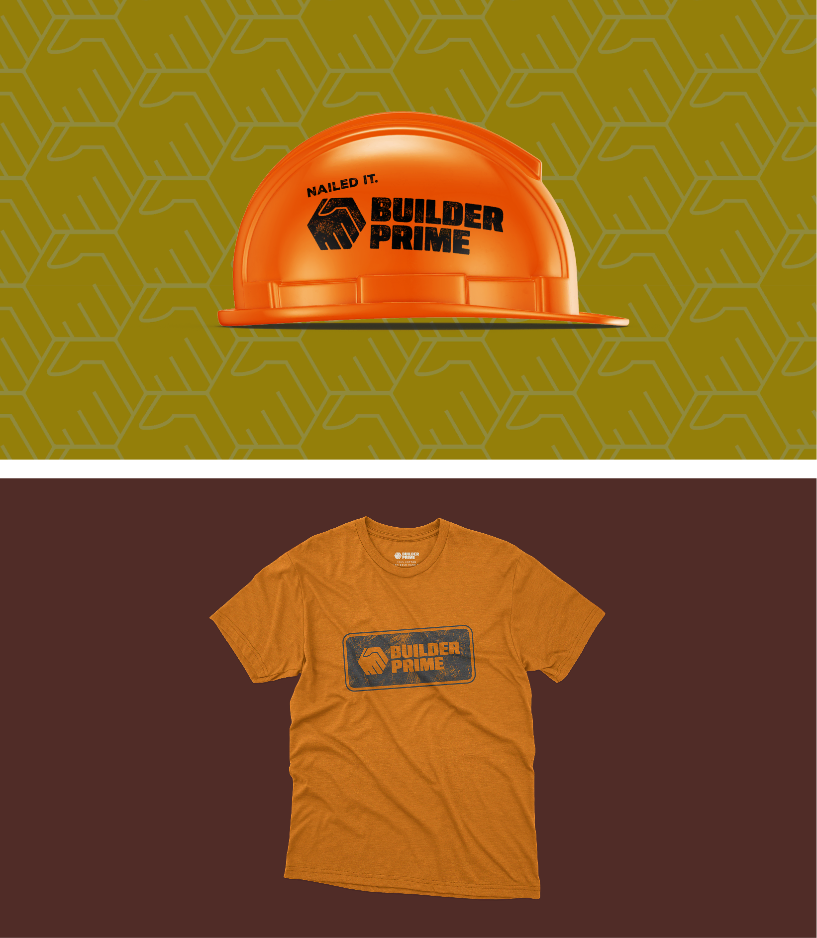
The original logo was designed by the company’s founder and was never intended to be permanent. The new logo better represents their brand values of supportive collaboration and trust.
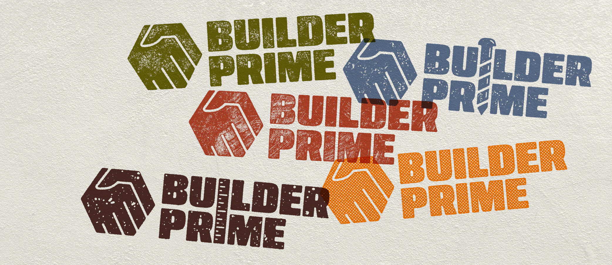
Some alternate logo versions include the incorporation of familiar contractor motifs like a tape measure and a screw. I also experimented with various textures to add more personality to the logo.
The team wanted to keep orange as their primary color, but the original shade did not pass contrast tests. I tweaked the color slightly and added a variety of supporting colors that were earthy and approachable, yet bold.
The primary distressed typeface is intended to be used sparingly, so I provided an alternate font that could be used in its place. The secondary typeface is a simple and grounding sans serif.
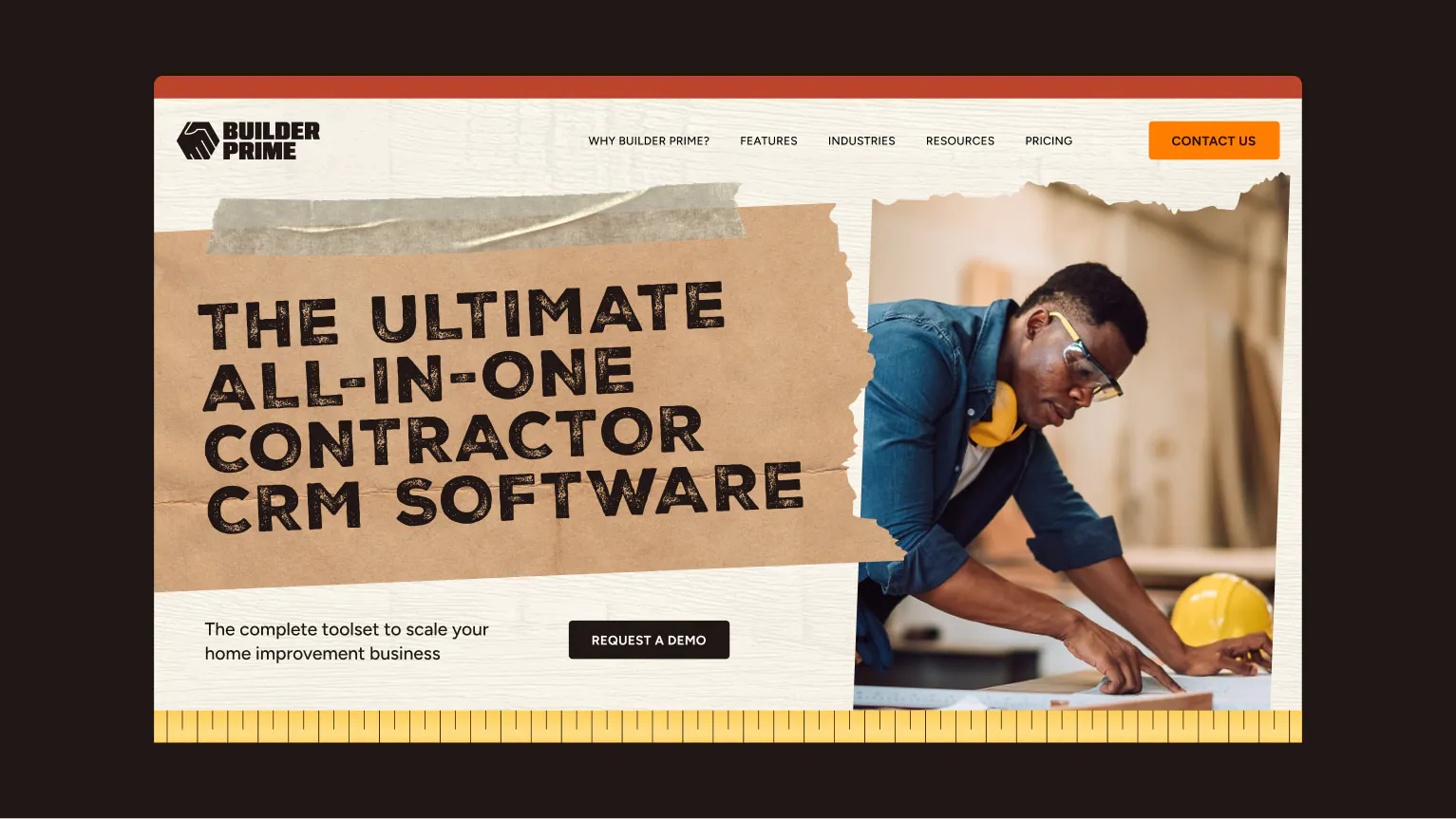
Example of what a home page could look like. The final art direction included additional graphic elements like ripped paper, masking tape, and natural textures.